Introduction
Color theory is a fundamental aspect of multimedia design that can greatly enhance the effectiveness and visual appeal of your multimedia projects. By understanding the principles of color theory and how colors interact with each other, you can create designs that communicate your message more effectively and leave a lasting impact on your audience.
In this article, we will delve into the basics of color theory, explore its psychological impact, and discuss its application in graphic design. Whether you are a beginner or an experienced designer, this knowledge will provide you with a solid foundation to create visually captivating and impactful compositions.
Points to Note:
- Color theory is essential for creating visually appealing and effective designs in multimedia.
- Understanding color relationships and the color wheel is key to manipulating colors effectively.
- Colors have a psychological impact on individuals, influencing their emotions and behaviors.
- Color harmony is crucial for creating visually balanced and pleasing designs.
- The color wheel is a tool for creating color palettes and exploring different combinations.
Table of Contents
The Basics of Color Theory
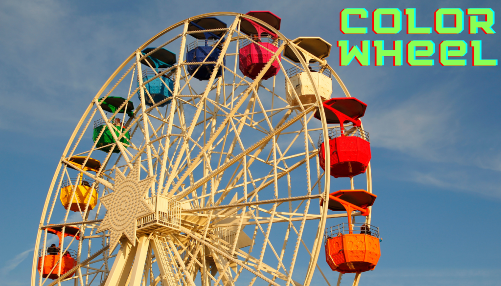
The color wheel serves as a foundation for creating color palettes and exploring different color combinations. When working with the color wheel, designers can use complementary colors to create high contrast and make elements stand out. Complementary colors are opposite each other on the color wheel and create dynamic visual impact. For example, pairing blue and orange or red and green can draw attention and create a bold statement.
Color theory is a fundamental concept in design that explores the relationships between colors and how they interact with each other. By understanding these relationships, designers can effectively use color to evoke specific emotions and create visual harmony in their compositions.
The color wheel is a valuable tool that visually represents the primary, secondary, and tertiary colors, providing a framework for understanding color relationships. It consists of twelve colors that are arranged in a circular format, allowing designers to easily identify color schemes, complementary colors, and analogous colors.
| Color Combination | Description |
|---|---|
| Complementary | A combination of colors that are opposite each other on the color wheel, creating high contrast and visual impact. |
| Analogous | A combination of colors that are adjacent to each other on the color wheel, creating a smooth transition and visual harmony. |
| Warm vs. Cool | A contrast between warm colors (red, orange, yellow) and cool colors (blue, green, purple) that creates different emotional responses. |
Color Categories
The color wheel is divided into three main categories: primary, secondary, and tertiary colors.
Primary Colors
These are the three colors that cannot be created by mixing other colors: red, blue, and yellow. All other colors are derived from these primary colors.
Secondary Colors
These colors are created by mixing two primary colors. The secondary colors are orange (red + yellow), green (yellow + blue), and purple (red + blue).
Tertiary Colors
These colors are created by mixing a primary color with a secondary color that is adjacent to it on the color wheel. Tertiary colors include red-orange, yellow-orange, yellow-green, blue-green, blue-purple, and red-purple.
Forms of a Color

Understanding hue, saturation, and value allows designers to manipulate colors and achieve the desired visual effects in their designs.
- Hue: Hue refers to the purest form of a color, such as red, blue, or yellow. It is the color’s distinctive characteristic.
- Saturation: Saturation refers to the intensity or purity of a color. A highly saturated color appears vibrant and bold, while a desaturated color appears more muted and faded.
- Value: Value refers to the lightness or darkness of a color. It is determined by adding white (tint) or black (shade) to a color. Lighter values are considered tints, while darker values are considered shades.
By adjusting the hue, saturation, and value of a color, designers can create visually diverse and engaging compositions that effectively convey their intended messages.
Color Relationships and Their Effects
Color relationships play a crucial role in design and can evoke specific emotions and create visual harmony.
- Complementary Colors: Complementary colors are located opposite each other on the color wheel. They create a high degree of contrast and make elements stand out. For example, red and green are complementary colors.
- Analogous Colors: Analogous colors are adjacent to each other on the color wheel. They create a smooth transition and harmony in a design. For example, blue and purple are analogous colors.
- Triadic Colors: Triadic colors are evenly spaced around the color wheel, creating a dynamic and visually exciting composition. For example, the triadic colors of red are blue and yellow.
Designers must consider these color relationships when selecting color schemes and create a balanced and visually pleasing design that effectively communicates the desired message.
The Psychological Impact of Colors

Colors have a profound psychological impact on individuals, influencing their emotions, perceptions, and behaviors. Different colors evoke different emotions, such as red and orange for energy and passion, and blue and green for calmness and tranquility.
When it comes to design, understanding the psychological impact of colors is crucial. By strategically using colors that align with the desired emotional response, designers can shape the viewer’s perception and behavior.
Red and Orange
These colors are associated with energy, passion, and excitement. They can create a sense of urgency and grab attention. They are often used in calls to action and to stimulate appetite in the food industry.
Blue and Green
These colors are known for their calming and soothing effect. They are associated with nature, tranquility, and harmony. Blue is often used to create a sense of trust and reliability, while green is associated with growth and freshness.
The use of these colors in design can elicit specific emotional responses and enhance the overall user experience. Whether it’s creating an energetic brand identity or establishing a calming atmosphere, color plays a crucial role in shaping our perception of a design.
To further illustrate the psychological impact of colors, here is a table showcasing commonly associated emotions and behaviors:
| Color | Associated Emotions | Associated Behaviors |
|---|---|---|
| Red | Energy, Passion, Excitement | Increased heart rate, sense of urgency |
| Orange | Warmth, Enthusiasm, Creativity | Increased appetite, enthusiasm |
| Blue | Calmness, Trust, Reliability | Relaxation, trust in the brand |
| Green | Harmony, Growth, Freshness | Feelings of balance, association with nature |
Color Harmony and its Role in Design
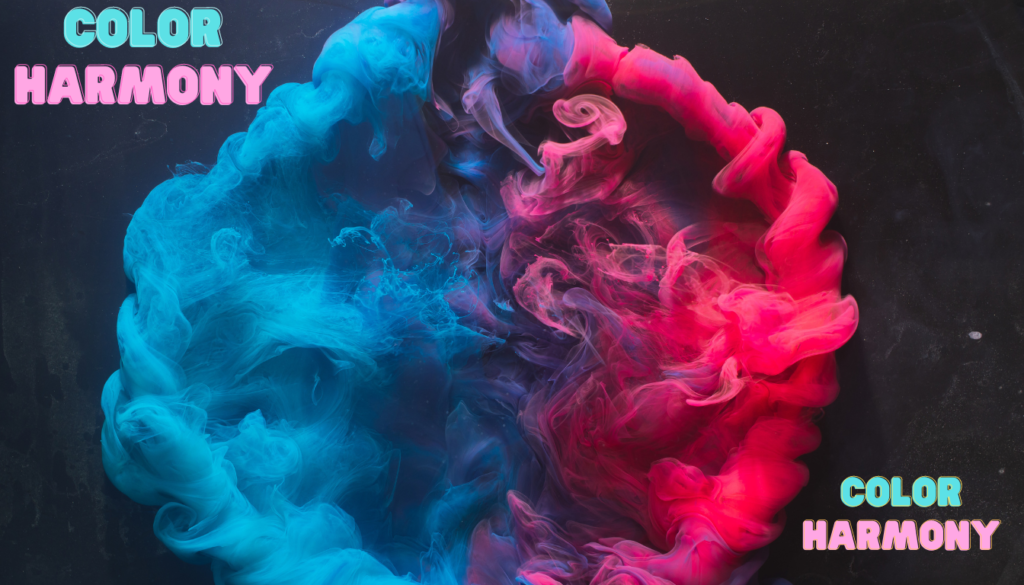
Color harmony is a crucial aspect of design that contributes to creating visually pleasing and balanced compositions. By understanding and utilizing different color schemes, designers can achieve harmonious designs that evoke specific emotions and captivate viewers. Additionally, maintaining color balance within a design helps create a sense of equilibrium and visual satisfaction.
Types of Color Harmony:
Monochromatic
This color scheme uses different shades and tints of a single color to create a harmonious and unified design.
Analogous
Analogous color schemes involve choosing colors that are adjacent to each other on the color wheel, creating a smooth and visually cohesive composition.
Complementary
Complementary colors are positioned directly opposite each other on the color wheel and create high contrast, adding excitement and vibrancy to a design.
Triadic
Triadic color schemes consist of three colors that are evenly spaced on the color wheel, providing a dynamic and energetic visual impact.
Designers can choose from these color schemes based on the desired emotional response and overall aesthetic of their design. By understanding the principles of color harmony, designers can create visually pleasing and engaging designs that effectively communicate their message.
| Color Scheme | Description |
|---|---|
| Monochromatic | Uses variations of a single color for a harmonious and unified look. |
| Analogous | Utilizes colors that are adjacent to each other on the color wheel for a smooth and cohesive composition. |
| Complementary | Pairs colors that are opposite each other on the color wheel, creating high contrast and visual excitement. |
| Triadic | Consists of three colors that are evenly spaced on the color wheel, providing a dynamic and energetic visual impact. |
By selecting the appropriate color scheme and achieving color harmony, designers can create visually stunning compositions that effectively communicate their intended message and resonate with their audience.
Color and Cultural Significance
Colors have a deep cultural significance and can hold symbolic associations that vary across different cultures. The interpretation of color can differ based on cultural nuances, making it essential for designers to consider these factors when creating visually impactful designs.
Understanding the cultural significance of colors is crucial to avoid unintentionally offending or alienating your audience. By leveraging cultural associations with colors, designers can create designs that resonate with specific cultural backgrounds and evoke the desired emotional response.
Symbolic Associations of Colors in Different Cultures
| Color | Symbolic Associations | Cultural Nuances |
|---|---|---|
| Red | Passion, luck, celebration | In Western cultures, red is often associated with love and romance, while in Asian cultures, it symbolizes good fortune and happiness. |
| White | Purity, innocence, peace | White is often associated with weddings and represents purity in Western cultures. In some Eastern cultures, white symbolizes mourning and is associated with funerals. |
| Black | Mystery, elegance, power | In many Western cultures, black is associated with formality and sophistication. However, in some cultures, black represents mourning and is used in funeral ceremonies. |
| Yellow | Happiness, joy, optimism | Yellow is often associated with positivity and warmth in many cultures. However, in some countries, it can also symbolize jealousy or betrayal. |
By understanding the symbolism and cultural associations of colors, designers can create designs that effectively communicate the intended message and resonate with their target audience. Cultural sensitivity and awareness play a crucial role in the successful execution of designs that appeal to diverse cultural backgrounds.
Application of Color Theory in Graphic Design

In the world of graphic design, color theory serves as a guiding principle for creating visually appealing and effective designs. By understanding the psychological impact and relationships between colors, designers can strategically utilize color palettes to convey the intended message and establish a strong visual identity.
Choosing the right color palette is crucial in graphic design as it sets the tone and mood of the design. Different colors evoke different emotions and perceptions, allowing designers to create specific experiences for the viewer. A well-chosen color palette can make a design aesthetically pleasing and memorable, leaving a lasting impact.
Logo design, in particular, heavily relies on color theory to communicate brand personality and values. Companies carefully select colors that align with their brand image and evoke the desired emotional response. For example, warm colors like red or orange may be used to convey energy and passion, while cooler tones like blue or green may evoke calmness and tranquility.
Furthermore, color theory also helps designers establish visual hierarchy and balance in their designs. By understanding color harmony and the principles of color contrast, designers can create a visually pleasing and balanced composition that guides the viewer’s eye to important elements within the design.
Color Palette in Logo Design (example)
To illustrate the application of color theory in logo design, let’s take a look at some well-known brands and their color choices:
| Brand | Color Palette | Meaning and Associations |
|---|---|---|
| McDonald’s |
| The bold and energetic combination of red and yellow reflects the brand’s playful and vibrant nature. |
| The color blue conveys trust, reliability, and a sense of connection, aligning with Facebook’s mission of connecting people globally. | |
| Coca-Cola |
| The iconic red color represents excitement, happiness, and the brand’s bold presence in the market. |
By carefully selecting colors in accordance with color theory principles, these brands have successfully established a visual identity that resonates with their target audience.
Overall, the practical application of color theory in graphic design is crucial to create visually appealing and effective designs. From creating a well-balanced color palette to strategically selecting colors in logo design, understanding color theory empowers designers to create impactful and visually captivating compositions.
Understanding Color Mixing Models
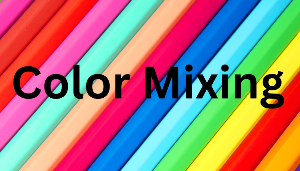
When it comes to working with colors in design, understanding the different color mixing models is essential. The two main color mixing models used in graphic design are RGB and CMYK. Each model has its own unique characteristics and is used in different mediums for achieving accurate color reproduction.
RGB: Additive Color Mixing
The RGB color model is primarily used for screens, such as computer monitors, TVs, and mobile devices. It is an additive color mixing model, meaning that it starts with black and adds light to create colors. In RGB, the primary colors are Red, Green, and Blue.
By combining different intensities of these three primary colors, a wide range of colors can be achieved. For example, mixing red and green light produces yellow, while mixing red and blue light produces magenta.
Here’s a table showing how different combinations of red, green, and blue intensities produce various colors:
| Red Intensity | Green Intensity | Blue Intensity | Resulting Color |
|---|---|---|---|
| 255 | 0 | 0 | Red |
| 0 | 255 | 0 | Green |
| 0 | 0 | 255 | Blue |
| 255 | 255 | 0 | Yellow |
| 255 | 0 | 255 | Magenta |
CMYK: Subtractive Color Mixing
The CMYK color model, on the other hand, is used for printing purposes. It is a subtractive color mixing model, meaning that it starts with white and subtracts ink to create colors. In CMYK, the primary colors are Cyan, Magenta, Yellow, and Black (Key).
By combining varying amounts of these four ink colors, a wide range of colors can be reproduced. For example, mixing equal amounts of cyan, magenta, and yellow inks produces a neutral gray, while adding more black ink can create darker shades.
Here’s a table showing how different combinations of cyan, magenta, yellow, and black inks produce various colors:
| Cyan | Magenta | Yellow | Black | Resulting Color |
|---|---|---|---|---|
| 0% | 0% | 0% | 100% | Black |
| 0% | 100% | 100% | 0% | Yellow |
| 100% | 0% | 100% | 0% | Magenta |
| 100% | 100% | 0% | 0% | Cyan |
Understanding the differences between RGB and CMYK and knowing how to work with them can ensure accurate color reproduction in various mediums, whether it’s on screens or in print.
Conclusion
Color theory is an essential element of multimedia design that holds immense power in creating impactful and visually captivating compositions. By studying color theory and applying its principles, you can unlock the potential of colors to evoke specific emotions, communicate messages, and engage your audience.
Multimedia designers who understand color theory can effectively manipulate colors to achieve desired outcomes in their designs. Whether it’s creating a sense of harmony, balance, or contrast, color theory provides a framework to guide your decisions and ensure that your designs resonate with your intended audience.
Looking ahead, the future of color theory in design shines brightly, with new trends and techniques constantly emerging. As technology continues to advance, we can expect innovative techniques for color exploration and application. Staying updated with these trends will allow you to push the boundaries of your design work and create truly memorable visual experiences.
FAQ On Color Theory
What is Color Theory?
Color Theory is a set of principles used to create harmonious color combinations and convey the desired message effectively. It’s the science and art of using color in design and art to evoke emotions and actions.
Why is Color Theory important in design?
Color Theory is crucial because it influences viewers’ perceptions and emotions. Understanding color relationships and the psychological effects of color can significantly improve the effectiveness and aesthetics of a design.
What are primary, secondary, and tertiary colors?
Primary colors are the base colors that cannot be made by mixing other colors together (red, yellow, and blue). Secondary colors are made by mixing two primary colors (orange, green, purple), and tertiary colors are made by mixing primary and secondary colors.
What is the color wheel?
The color wheel is a visual representation of colors arranged according to their chromatic relationship. It often shows primary, secondary, and tertiary colors, and helps in understanding how different colors interact with each other.
Can Color Theory affect the mood of my design?
Yes. Colors have the power to affect mood and evoke different emotional responses. For example, blue can evoke calmness and professionalism, while red can convey passion and urgency.
What are complementary colors?
Complementary colors are pairs of colors that, when combined, cancel each other out. This means they produce a grayscale color like white or black. When placed next to each other, they create the strongest contrast and reinforce each other. Complementary colors are opposite each other on the color wheel.